The new new frozenfractal.com
I didn’t plan it this way, but it seems to be becoming a tradition: redesigning this website around the new year. Last time, we went from this…
… to this:
Why couldn’t I leave well enough alone, and had to redesign it to look like this instead?
Why a redesign?
It mostly has to do with the target audience of the site. The first incarnation was written mainly with fellow game developers in mind. Its main feature was the blog; notice how the Games page was second to last in the navigation bar!
When I became a full-time indie last year, it was necessary to broaden the scope of the website. If you’re financially dependent on your games, the most important people to speak to are your players. So I pulled the Games section towards the top, and added subsections so I could highlight particular games. I also changed the design from a narrow fixed-width column to a full-width layout, so each individual game’s page had plenty of room to present itself in its own style.
However, I’ve recently come to realise that this didn’t make much sense. If I want to promote a particular game, and want to give players a place to come to (and keep coming to!), it would be much better to create a dedicated website instead. This is the route we went with Twistago, and it just seems so much more logical.
So the new site partly goes back to its roots as a site for fellow gamedevs. However, you can’t have failed to notice that I made the games even more prominent, with a selection of titles, images and hover descriptions right on the front page. Why? The reason is that a third audience has come to my attention. Thus far, I haven’t been able to live off my own games, so I need to do freelance development to keep the ship afloat. And what better way to attract potential clients than presenting your previous work in an appealing way? More and more, I came to think of this website as a portfolio, so I designed it accordingly. Take a look at the games page in particular to see what I mean.
Layout
A year ago, I wrote:
A major layout change is that the navigation has moved from the top to the side. The main reason for this was that the top navigation could only contain five entries, by design, so it didn’t provide me with the flexibility to add game-specific pages without tucking them away in a pullout menu.
Then why did I go back to a top navigation? One reason is visual balance. Especially for the blog, I wanted a very clean look: just a column of text, nothing else to get in the way. Another reason is that, even though it can still only fit five items, the new navigation structure doesn’t need any more than that. (And if it does, I can add more.)
Of course, the content of the new site has to be fully responsive. Since last year, I’ve had some experience with Bootstrap, in particular its grid system, and grown to appreciate the flexibility it offers to make things look different on different screen sizes. I didn’t want to pull in all of Bootstrap just for some grid classes, so I wrote my own, but they conveniently have the same names and implementation. Things should stretch and stack well now, from tiny 320-pixel mobile screens to huge 4k monitors.
Visual motif
The redesign started with the shape of the Frozen Fractal logo:
It’s based on the Koch snowflake, which is a simple fractal that you get by starting with an equilateral triangle, and continually adding smaller triangles onto the middle ⅓rd of each side:
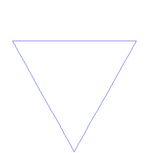
The notion of a horizontal line, with intersecting lines at 120° angles, brought me to the navigation bar as you see it today. Subsequently, it made sense to reuse this “arrow” motif in the action buttons as well.
On the old new site, the background of the navigation bar sported an interactive cellular automaton, simulating Conway’s Game of Life and variants thereof. It was using squares instead of triangles, so I couldn’t integrate it well with the new navigation bar. I have been working on a version using triangular cells instead, and indeed everything has been aligned with that triangle grid in mind. However, that took a bit too long to finish, so I decided to launch first and bring back the automaton later.
Colours
Another reason why I wanted to redesign the site is that I’d been unhappy with
the drab and bland colour scheme. The dark grey navigation bar drew too much
attention to itself, but with the current “glowing white” logo, making the
background lighter was not an option. The white was of course mandated by the
snowflake shape of the logo. I decided to keep the logo shape, because I’m
still quite fond of it and think it fits well for a game development studio,
but I ignored the “whiteness” association and chose a more saturated colour. I
did keep it on the “cool” side of the spectrum and ended up with a lovely
#27dddd.
The next step was to pick some secondary colours. For these matters, Paletton has always been my go-to tool. I know I’m not great with colours, so I enlisted my girlfriend for a second opinion (any remaining bad taste is purely my own). With her help, I ended up with a triad of aquamarine, gold and hot pink. It took some getting used to, but I think it works well. A nice touch that nobody but me will notice is that these are equidistant (120°) on the colour wheel, forming the equilateral triangle pervasive throughout the design:
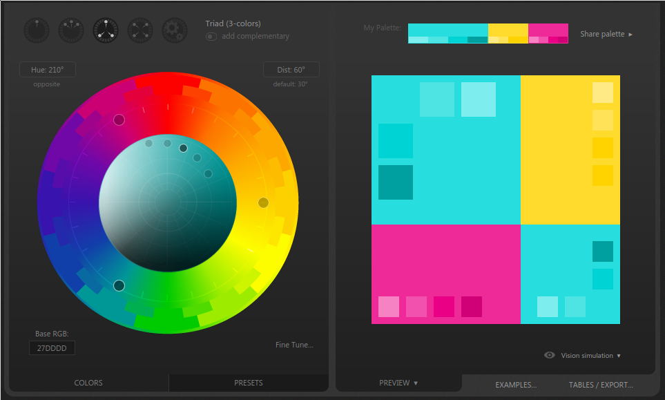
Because the aquamarine primary colour was chosen for the logo, and also because it’s the least attention-grabbing of the three, I worked that throughout the navigation bar. Hot pink became the hover and highlight colour, because gold is too light to work as a background for white text. That left gold for the little accents, like heading underlines.
Typography
The headline font from the old site (Nova Square) was chosen for its diagonally sliced stems, which fit in reasonably well with the logo, albeit not being at the same angle. However, I had come to hate the font too much to continue using it so ubiquitously; moreover, it only comes in one weight and I’d been using faux bold thus far (yuk!). So, I restricted Nova Square to the navigation bar instead, where it’s closest to the logo and the triangle connection matters most.
I continued with the most important font choice, the one people will be reading the most: the body font. This would feature most prominently in the blog section, and so I let myself be inspired by that most readable of all blog platforms, Medium. (If you’re into design and typography, be sure to check out their Designing Medium blog.) Medium uses the Charter font, a serif font designed to be readable on screens. I wanted to keep the serifs, but was more drawn to the more classical, Garamond-like Crimson Text instead. Text sizes and line spacing at different screen sizes were still very much inspired by Medium, however.
For the new headline font, I ended up with a rather contrasting choice: Raleway. It’s become a bit of a cliche on the web these days, but it was suggested by Google Fonts as a good pairing with Crimson Text, and I found it was simply the best fit. Unlike Nova Square, at least it comes with a professional selection of weights.
Underlines
Speaking of Medium, they also pioneered a new technique for underlining. Traditional underlining in browsers sucks, because the line is drawn behind descenders of letters like ‘g’ and ‘j’, instead of being interrupted by them. There is also no control over line thickness, and browsers tend to make wrong choices here. All this can be worked around by adding a background “gradient” to draw the underline, and then adding several white text shadows to cut out bits of the line.
I started out doing that for all links on the site. It looked nice, but it’s a
technical nightmare. No longer can you turn off the underline in CSS by a
simple text-decoration: none; instead, you have to remove the background,
and remove the text shadow. For both, you have to take care not to accidentally
override any background or text shadow that you actually want on the element.
If you actually want a text shadow in addition to the underline, you’re in
trouble. And in any case, because the text shadow has to be the same as the
background colour, you have to know what the background colour will be, and
cannot use this for text on images at all. All in all, this technique was more
trouble than it’s worth, and I restricted its use to headline elements only,
whose environment is much more predictable than that of links.
Navigation
Just like on the old site, clicking a link doesn’t actually reload the entire page (unless you have JavaScript disabled). I added a script that fetches the HTML, grabs the content element, and replaces the content without disturbing the rest of the page. This was necessary for the cellular automaton to do its animation, but it also allowed me to add a nice crossfade.
It took some time to get all this working in all situations (outbound links, browser back button, scroll position) but I think it’s all working well now. If not, please let me know.
Contents
How could I have run a website about games, without a single game image on the front page?! I had been seeing the new Games page in my mind’s eye for months already, and now that it’s complete, I can say it looks even better than I imagined. I like to scroll through it and take pride in all the things I’ve made over the past years.
I got a bit carried away with this new format, because I also redesigned the Tools page in the same way, and added a couple of tools that I forgot before.
All other pages were also designed to lesser or greater extent. The home page is still a bit more cluttered than I would like; in particular the Twitter widget stands out like a sore thumb. I decided to postpone all these details until after launch. Good enough for now!