Menu layout
Like last week’s, this post is a day behind schedule as well. Since I’m working on my part-time side job on Tuesdays and Wednesdays, it was a silly schedule anyway – changing to Thursdays to accommodate.
Today, I designed and implemented the look of the game’s menus. At first, I thought of making them look like a supermarket; but what would that look like? To a large extent, supermarkets look like the random mishmash of products that are on the shelves. So I took some leaflets and advertisements, and modelled the look after those instead.
Characteristics of this look are:
- Lots of photographs of the actual products.
- Bold, bright, flat colours. Couldn’t be easier.
- Bold, large sans-serif letters and numbers. I found the font Boris Black Bloxx, which is free, and nearly perfect for my purpose. The kerning could be better in places, but nobody will notice except for me.
- Cents are in superscript, hovering above the decimal point. Always.
Here’s the preliminary result:
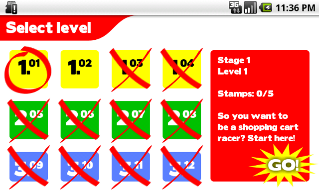
Unfortunately, I had no room for actual product pictures on this screen, nor would they make much sense. The Shop screen will certainly have these, though. I chose to leave the status bar visible in the menus, because it contains useful information for the phone user; it is only hidden during the actual gameplay.
I whipped the graphics up in an hour; it took me the rest of the day to get them working in the game. Building and even styling a GUI with Android’s XML syntax should be straightforward. Unfortunately, the actual experience is more like HTML and CSS: lots of tinkering, unexpected results, and the occasional hideous hack. It will become faster and easier with experience, but despite all the examples and tutorials, not everything is easy to do right from the start.
Take, for example, the GridView. At first sight, it seems ideal for those 12 level icons, doesn’t it? Until you find out about its stretching behaviour. I could find no way to make the GridView honour the wrap_content flag; it insisted on becoming as wide as the screen. There’s an option stretchMode, but the documentation for it is missing. Setting a fixed width (in dp, device-independent pixels) on the GridView works, but is far from elegant. And that was only the horizontal layout. In the vertical direction, no matter what I tried, the height of the items would not become the 64dp that I specified, and they kept shrinking to fit tightly around their content. Ignoring that for the time being, I tried to get the overlay X and O images to show up outside the item’s boundaries. There is a flag clipChildren for all ViewGroups, but guess which particular ViewGroup apparently ignores it? In the end, I abandoned the GridView and built a grid system out of programmatically created RelativeViews instead.
(Note: the above is a reconstruction from memory, so some things may be wrong. I did not file bug reports because “select isn’t broken”: it’s more likely that it is my own misunderstanding that is wrong, not the Android framework. If anyone knows solutions to any of these problems, I’d love to hear them.)
There are still plenty of issues to be worked out. The lower row of icons are too small. The layout breaks down on any resolution that is not my phone in landscape mode.
I still have to add stamps at the bottom of level icon, to indicate your progress for that level. I also need to show your current stamp count in the top right of the screen. Maybe I’ll also add a little map of the level in the red bar.
I also want to add some more images for button states, to make it feel more interactive; right now, it feels too much like touching a static image. On a mouse-operated computer, you can make items ‘pop up’ when you hover over them, indicating that the button can be clicked. On a touch screen, you don’t have that luxury; it will have to be immediately obvious what is clickable and what isn’t. Can you figure out what parts of the above screenshot are touchable?
What do you think of the look so far?