Graphics are born
It’s been over two months since my last post, in which I announced that I was abandoning JavaScript for the development of Turtle Paint, and switched to Ruby instead. So far, it has been a great learning experience, and I’m loving this language more every day. There are a number of interesting technical posts that I want to write about the new internals of the game, but those are for another day.
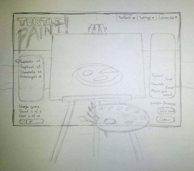
Today I’m feeling more superficial and have been doing some UI design work. This image had been in my head for some time, but I was happy to discover that it works on paper, too.

The overall positioning of the elements on screen isn’t much different from what I’ve got today, because it gives a symmetric and balanced look.
The thick frame has the dimensions of an 980×661 browser viewport, which by some freaky coincidence is exactly the viewport of Safari on the iPad in landscape mode (but it’s a sane size for desktop browsers as well). The iPad would be the ideal platform for Turtle Paint, except for one teensy detail: the keyboard would take up half the screen. I suppose it would work okay in portrait mode, and meanwhile I’m hoping that Apple will come up with decent speech recognition at some point.
It might be hard to see in this sketch, but the backdrop is supposed to be a beach – beaches being the place where one finds turtles, right? (I could have done sewers instead, but that would have been a dark and smelly affair.) I’m planning to have some windsurfing, swimming and sunbathing turtles in the background, but those might not make it in the first iteration. There will be plenty of space for them to the sides, if I make the backdrop wider than the iPad frame; much like the entire thing will extend below the bottom of that frame, which will still be visible on desktop computers.
As you can see, I’m going for a very physical look and feel. The easel is leaning back slightly, making the canvas non-rectangular; you won’t be able to draw outside the canvas proper. The palette contains gobs of paint to select the colour to use, three or four different brush sizes, and a painter’s knife to erase (scratch paint off). The latter might need a tool tip to reveal its purpose, but I don’t think it’ll be a showstopper. I’ll also try giving the canvas some texture, and make the paint 5% transparent to let it shine through. It might look really classy.
Unfortunately, not everything is easily captured in that way. There are “Clear” and “Skip word” buttons, for which I couldn’t find suitable metaphors. Several other elements are also simply text. Although “3 of 5” and “4 of 10” could be represented graphically as a row of icons (e.g. checkboxes), I have yet to come up with a way of blending them in with the painting-on-the-beach theme. Maybe the guess list on the right side should fade into the horizon, to give the impression of depth, but I’m not sure how far I can shrink it before it becomes too small to fit all the guesses for the current round.
Interface elements appear and disappear depending on what is going on at the time. The “lobby”, where you choose a game to join, has the same backdrop but no easel or any of the other game elements. If we have joined a game, but are still waiting for it to start, the easel is shown without the canvas. The palette at the bottom is only shown while it’s your turn to paint. If it’s your turn to guess, it is replaced by the guess box, and the controls in the bottom right corner disappear. Everything will be smoothly animated; as I’m not much of an animator, I’ll restrict the animation to things that can be done with CSS3 transitions.
Next up is to convert all this from paper to Inkscape. That is the difficult step!