The new frozenfractal.com
I realized a long time ago that my website was looking a little dated. A dark theme, drab colours and not exactly mobile-friendly. So when I started fulltime in December, one of the first things I did was a major styling overhaul.
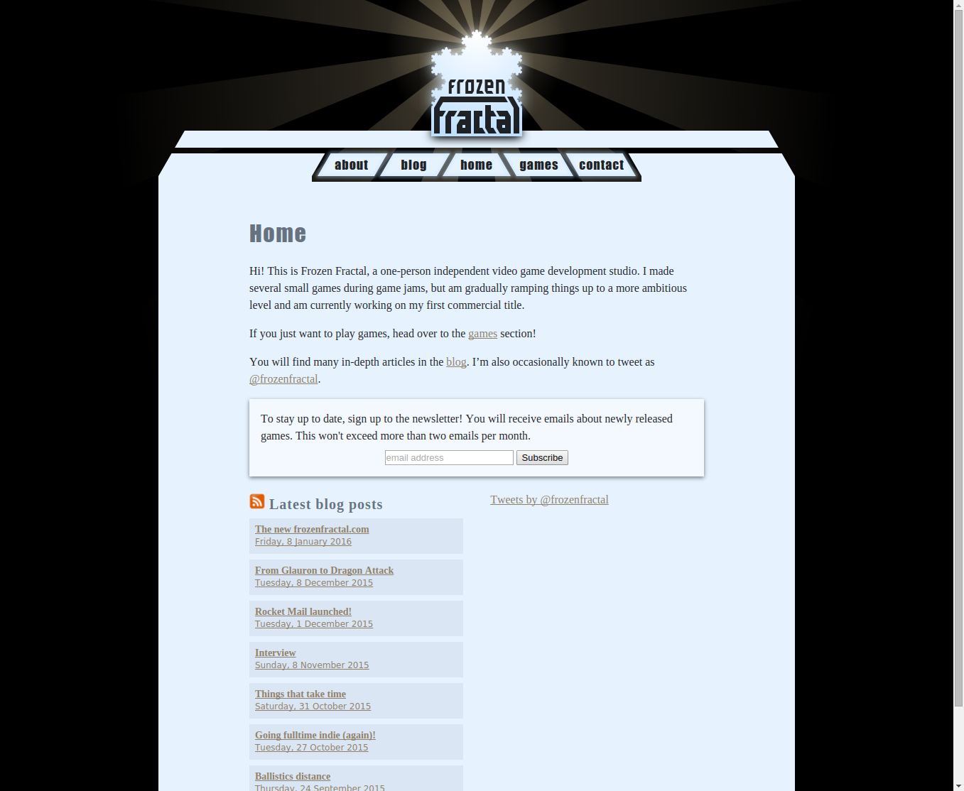
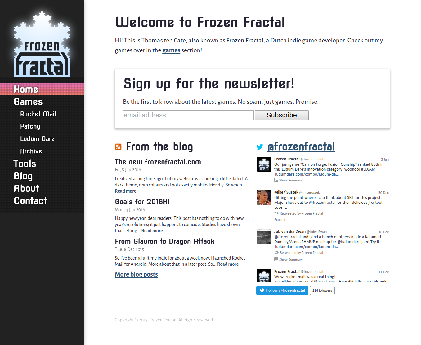
Another problem with the old site was that it wasn’t a very good commercial platform. The content area was just a 640px fixed-width column, which was fine for blogging, but left little room for games’ “marketing pages” which should put the game front and center, with big images and screenshots and not too much navigation in the way.
Layout changes
Before (minus a broken Twitter widget):

After:

A major layout change is that the navigation has moved from the top to the side. The main reason for this was that the top navigation could only contain five entries, by design, so it didn’t provide me with the flexibility to add game-specific pages without tucking them away in a pullout menu. More advantages are that a sidebar is easier to scan, and takes up only plentiful horizontal space instead of precious “above the fold” vertical space.
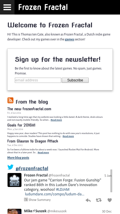
On small screens, the sidebar is hidden behind the ubiquitous “hamburger menu” or “hotdog menu”, widgets are placed underneath each other, and the font size adapts to some degree:

The cellular automaton
So far, it’s all pretty standard for a 2015 website. The one thing that is unique (as far as I know) is that the navigation bar is driven by a cellular automaton based on Conway’s Game of Life! I could write that I included this to encourage people to experiment with it and explore the site as a side effect, but the truth is that it just popped into my mind and I thought it would be cool to try. Anyway, it seems fitting for a site that’s about games (even though Game of Life isn’t a game per se).
You can see (if you’re in a feed reader, view it live on the site) that there is a grid of small cells drawn behind the navigation bar, and these get highlighted (“are born”) and dimmed (“die”) based on a set of rules. The rules are as follows:
If the mouse is hovering over an item, but it’s not the current item, apply the standard Game of Life rules. When the mouse pointer moves over a cell, that cell is brought to life, seeding the simulation. (Sadly, there is no way to see this on a touch-only device.)
If an item is selected, it is “seeded” by bringing three random cells to life. The rules are also changed: cells are born if they have at most 1 live neighbour, but not 2; and cells survive if they have at least 3 live neighours. This is commonly written as
B1345678/S345678. Such generous conditions were necessary to ensure that the entire row is eventually filled in; I failed to find a rule that achieved the same effect with less.If an item is deselected, nothing changes except the rules: no new cells are born, and cells die if they have fewer than 5 living neighbours, or exactly 7:
B/S568. This ensures that all cells eventually die, because at the corners there are always some with 4 neighbours or fewer. I determined this rule empirically, so I don’t even know for sure whether it always works.
An interesting point is that cells interact even across rule boundaries. So if you hover over an item next to the selected one, you’ll see some frantic Conway-like activity as cells are born and die according to Conway’s original rules, while their neighbours in the selected item just stay put. Clicking an item right above or below the selected one results in a particularly pleasing effect.
Technology
The technology behind all this hasn’t changed much. It’s still a static site, generated by Jekyll and served up by nginx. One thing I did change is loading of intra-site links: these now fetch the content via AJAX and replace just the content area. This was necessary for the sidebar animations, but it also improves loading speed and paves the way towards any animated transitions I might want to add in the future.
Conclusion
Is the new site objectively an improvement? For example, are users staying longer or interacting more? Sadly, I don’t know. My Google Analytics setup was accidentally including data from subdomains as well as the main site, skewing the data. I fixed this problem around the same time the site launched, so in the future I should have better data.
Although I feel that the new site is better, I’m still not quite satisfied. It feels a bit thrown together, lacking a certain unity. I’ll probably keep tuning it during the upcoming months.