Around The World, Part 10: Fixing the climate
This post is part of a series about Around The World, a game of exploration and discovery at sea. The game is currently in early development. If you're new to this project, you can read up on it here.
The previous post ended with a cliffhanger: how would we get rid of all the arid zones (pink) in the Köppen climate classification? An alternating game of spot-the-difference and whack-a-mole ensues.
Why so much pink?
Remember, here’s what we’re dealing with:
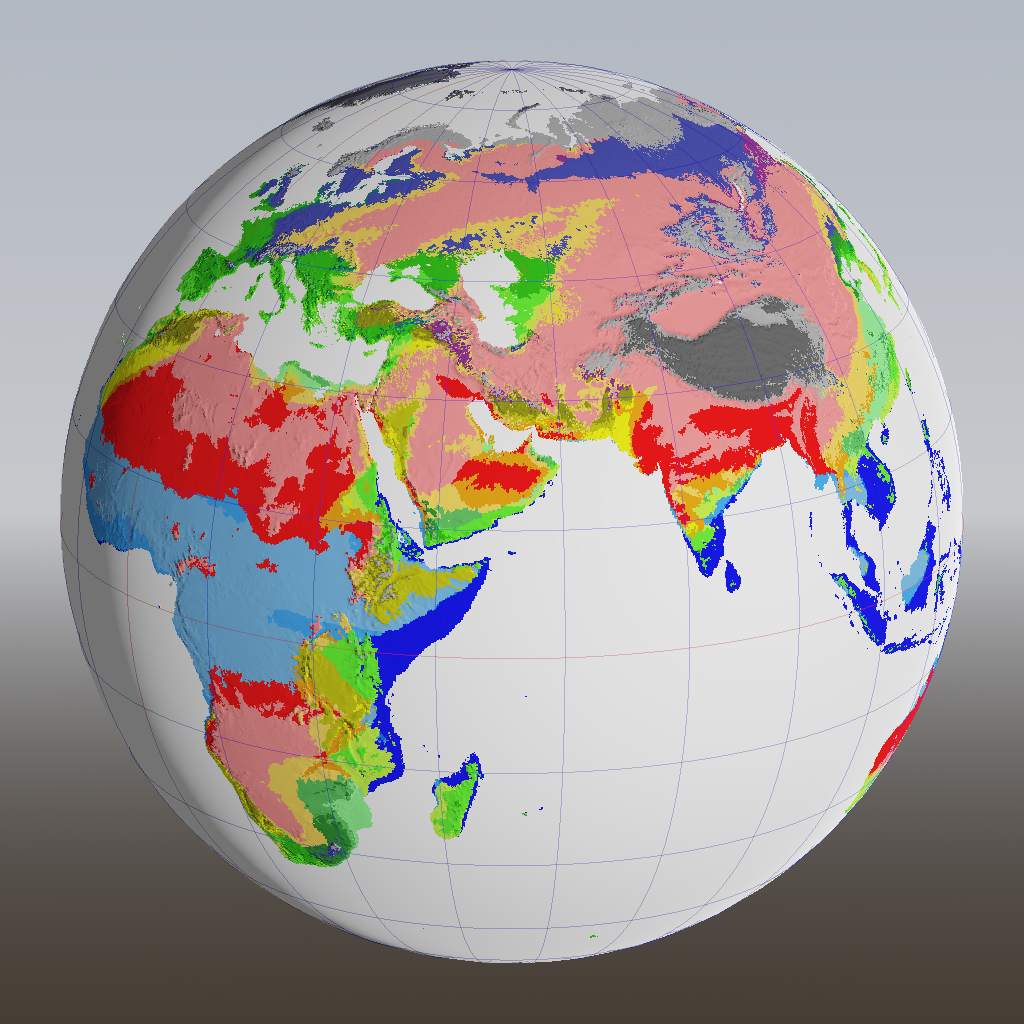
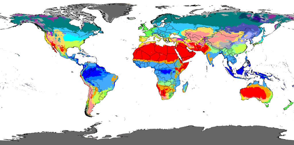
And we want it to look like this (but more spherical):
As a concrete example, let’s look at eastern Europe. It should be classified as Dfb, meaning humid continental climate, but the algorithm comes up with Bwk, cold desert, instead. The reason is that the algorithm only assigns about 20-30 mm of rain in July, and none at all in January. The yearly total is below the precipitation threshold for group B, arid climates, which is around 170 mm here.
So why doesn’t it rain as much as it should? The answer to that is something I wrote in a previous post:
Rain is produced by airborne moisture. Airborne moisture is produced by evaporation of water from the surface. In my model, evaporation only happens over water. In reality it happens over land too, but the amount of evaporation depends on how wet the land is, which depends on how much rain fell there, which is what we’re trying to find out in the first place. Chicken and egg.
So why does it rain at all in eastern Europe? It’s not because of water that evaporated from the sea; that water has already fallen as rain in western Europe (whose climate classifications are in the right ballpark). The rain in eastern Europe must then have come from water that evaporated over land.
I tried the obvious thing: adding some evaporation over land too. Not too much – just 50 mm per month at most, depending on temperature. Does that make a difference?
Well. We do now get a large swathe of teal, indicating subarctic continental climate, which is a slight improvement. (The lack of other types of continental climate turned out to be a bug in my Köppen implementation, so you’ll magically see light blue and cyan appear in screenshots further down.)
But now all the deserts (red and pink) are gone.
Why doesn’t it rain in the Sahara?
It makes sense that we get no more deserts, because we’ve added rain there too. That doesn’t happen in real life. So the next question is: why doesn’t it rain in the Sahara? Wikipedia has the answer:
The consistently warm, dry, and sunny conditions of the horse latitudes are the main cause for the existence of the world’s major hot deserts, such as the Sahara Desert in Africa [and basically all the others].
Those horse latitudes are the areas of predominantly sinking air around plus and minus 30° latitude, the outer boundaries of the Hadley cells (refresher). Incidentally, the same mechanism applies in reverse too: in the ITCZ around the equator, the air rises due to heating at ground level, and thereby cools and squeezes out all its moisture in the form of rain, allowing rainforests to grow.
Remember that my code determines precipitation (how much airborne moisture actually falls down) purely based on temperature. The warmer the air, the less rain falls out. So to mimic the drying effect of the horse latitudes, I would artificially need to make it hotter there. And when I went back to look at actual Earth data, I was surprised to see that this is actually correct!
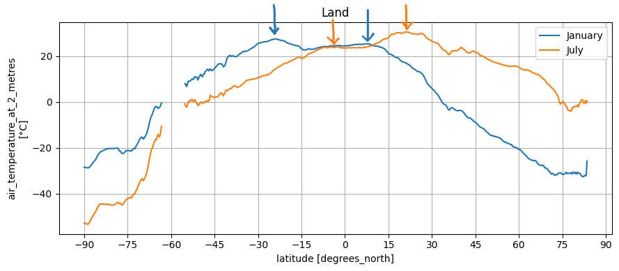
The maximum temperature in January and July doesn’t actually occur at the ITCZ, it occurs at the horse latitudes. It’s more pronounced on the summer hemisphere, but the bumps are visible on the winter hemisphere as well. Well, I can draw a curve to mimic that:
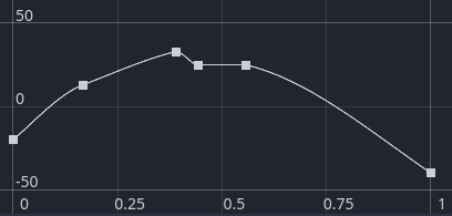
This curve is for January; the curve for July is inferred as its mirror image.
This makes the temperature map more realistic, but it doesn’t actually solve the problem, because my model is too simple. We need to make sure it hardly rains at the winter temperature in the horse latitudes as well. However, that’s below the (year-round) temperature at the equator, so to gain deserts, we would lose our rainforests.
But maybe we can approach it from the other side? After all, we don’t just control how much moisture falls from the air, we also control how much moisture goes into the air.
Evaporation again
The key to a solution is not to confuse actual evapotranspiration (which is evaporation from surface water and soil, plus transpiration from plants) with potential evapotranspiration or PET. PET is how much water would evaporate, if enough water was available. At sea, actual evaporation is always equal to PET. But on land, some areas are too dry, so the presence of water becomes the limiting factor. My algorithm for evaporation is just a lookup based on the temperature, so it doesn’t take the availability of water into account.
As a first step to make things more realistic, I implemented the Thornthwaite equation for potential evapotranspiration. Thornthwaite’s article was published in 1948, and it’s based on USA data only, as Thornthwaite himself writes:
Whether or not the formula can be used without modification to determine potential evapotranspiration in equatorial and polar regions is uncertain.
However, newer and probably more accurate equations require parameters like the “vapor pressure deficit” that I don’t have readily available, so I’m going to use this equation anyway.
The Thornthwaite equation turns out to be a huge improvement to evaporation totals. My original hand-drawn curve resulted in about 2200 mm of global average yearly evaporation, whereas the Thornthwaite equation gives me 983 mm. The true value is 990 mm, so we’re off by a mere 0.7%! (Technically, the 990 mm is precipitation, not evaporation, but they’re the same number — what goes up, must come down.)
This is nice, but by itself, it still doesn’t give us deserts.
Available moisture
The Thornthwaite equation gives an accurate representation of the potential evapotranspiration, and it can be applied at sea to find the actual evapotranspiration. On land though, we need to take the minimum of the PET and the amount of moisture that’s actually available for evaporation.
And that is something we can fake easily using another latitude-dependent curve, which yields after some tweaking:
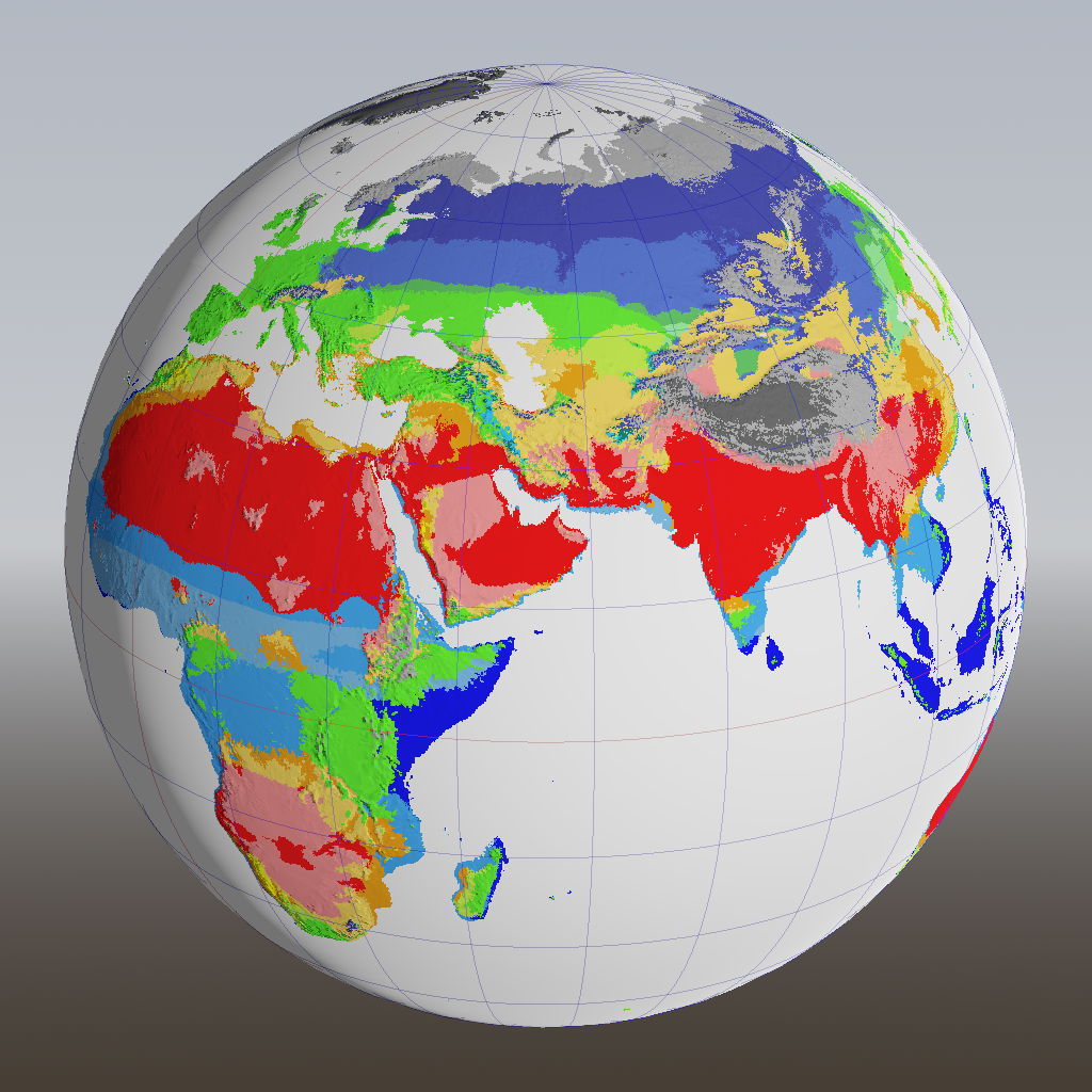
Hooray, there’s red — we got our deserts back!
There’s an unnaturally straight line across sub-Saharan Africa between light blue and lighter blue. I assumed that it was a consequence of this latitude-dependent factor, but it didn’t disappear after adding some simplex noise. It turned out to be something else: at that line, January and July temperatures cross each other, so the qualifications “summer” and “winter” are swapped. This causes one part to become Aw (tropical savanna, dry winter) and the other As (tropical savanna, dry summer). It’s pretty hot and dry in both seasons, so the difference is moot.
Winter rains
There’s one thing I’m still not happy with, and that’s the purple regions in the north. Those indicate continental climates with a dry winter. Take Minsk for example. In reality, it receives on average 47 mm rainfall in January and 97 mm in July. In our model, the July precipitation is spot on (thanks Thornthwaite!) but the January rainfall is exactly zero.
This happens because of a clamping in the Thornthwaite equation: if the monthly average temperature is below zero, total evaporation for the entire month is also zero. Surely, due to temperature fluctuations throughout the day, there could be temperatures above freezing, during which some evaporation is possible? Indeed, Thornthwaite himself writes:
In the climate of perpetual frost (E’) temperatures need not remain continuously below the freezing point. Although frost effectively prevents vegetation growth, and thus transpiration, nevertheless some water passes into the atmosphere by evaporation or sublimation.
Yet, he didn’t work this fact into his equation, perhaps because his USA data didn’t contain any perpetual frost climates — bits of Alaska might qualify, but it wasn’t a state yet, and doesn’t appear on any of his maps. But he doesn’t seem to have realized that the same argument also applies to places where it freezes only occasionally (thanks Thornthwaite!).
In the end I just forced a minimum evaporation amount of 50 mm everywhere (but still modulated by the curve to account for the horse latitudes). It’s simple but works surprisingly well.
All the world
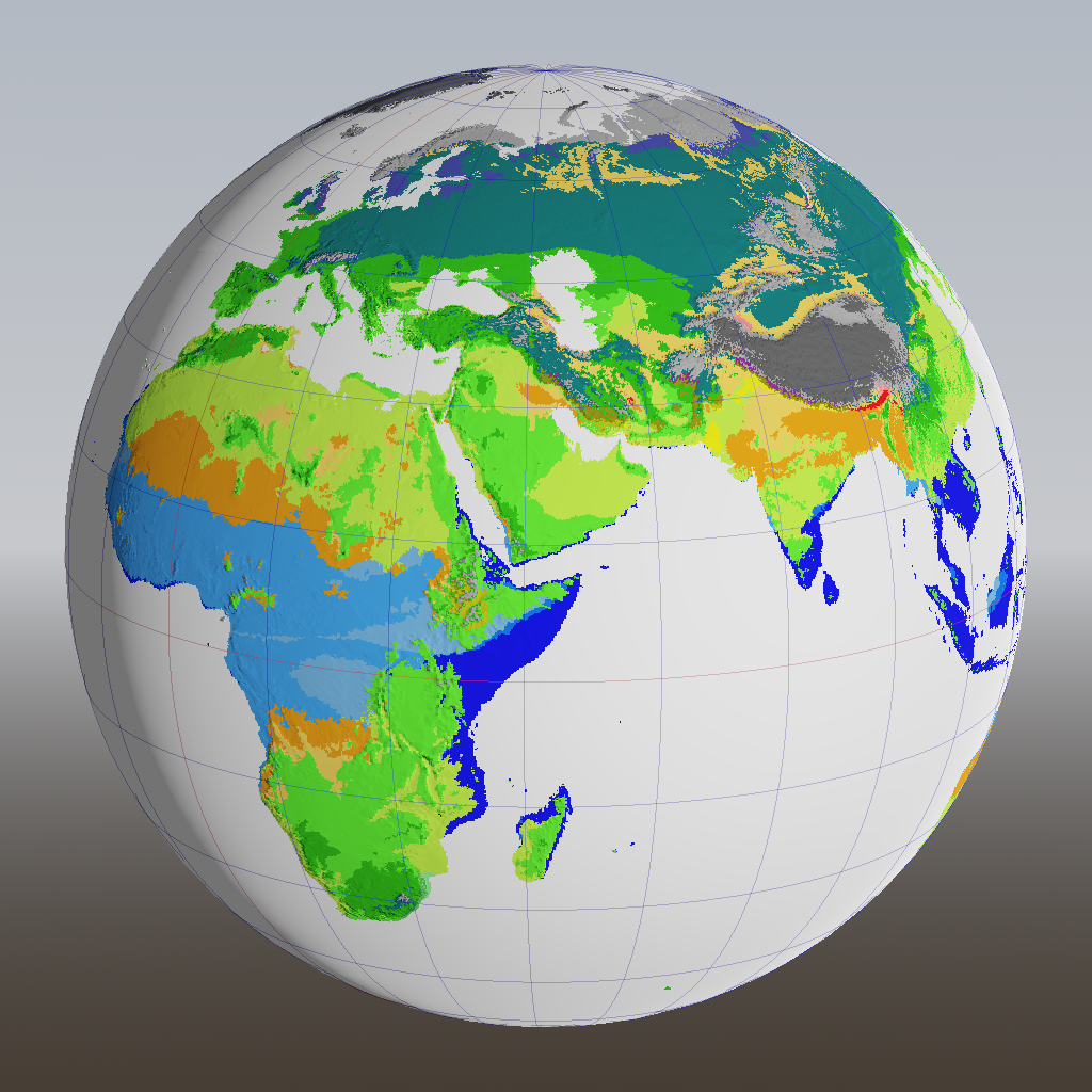
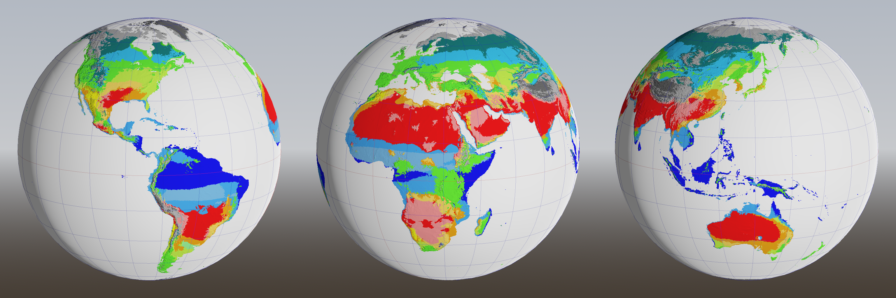
Here’s the final result, as three spheres because I still can’t be bothered to code up a planar map projection (click to enlarge):
Again the official Earth map for comparison:
I’m especially pleased with how Madagascar, Indonesia and Oceania turned out. Australia looks almost perfect!
I feel sorry for India, which is mostly classified as hot desert, because it happens to be in the wrong place (horse latitudes, same as the Sahara and Middle East). If I find in-game that there’s too much desert, I might just reduce the width of the dry region.
Most of the remaining differences are because the wind model comes up with prevailing winds that are different from the real ones. For example, half of the Horn of Africa is classified as rainforest and the other half as oceanic, even though it’s a hot desert in reality. But wind is a tricky beast to tame, so I’m going to leave these issues alone for now.
Future work
There’s one more thing that this model doesn’t do perfectly. In reality, most precipitation in the Iberian peninsula falls in the mountains; the flatter regions are arid. But in our model, the rain in Spain stays mainly in the plain.